Role Founding / Lead Product DesignerPeriod Jul 2022 – Apr 2026Platform Web (CIO, Advisor, Investor, Admin/Ops)
Quick Brief
🎯
The Challenge
Private market investing was inaccessible, paper-heavy, and locked behind $100K minimums. Advisors lacked the tools, knowledge, and confidence to allocate client capital into alternatives.
👤
My Role
Joined as a founding designer. Owned end-to-end product design across three platforms (CIO, Advisor, Investor), user research, design systems, and cross-functional strategy with engineering, sales, and investment teams.
⚡
The Pivot
Discovered that investors feared single-fund bets, not private markets themselves. Led the design shift from individual fund checkout to Custom Funds — bespoke multi-asset-class vehicles that transformed the business.
Mapped entire fund lifecycle end-to-end. Ran research with sales, advisors, and CIOs. Built and shipped iteratively — moving from discovery to production in tight cycles alongside a small, high-velocity team.
💡
What I Shipped
Quick Checkout, Custom Fund creation, Planner & Pacing tool, automated Proposals, Bulk Import, Evergreen Funds, and the 0→1 Radar rebalancing product — tested onsite with a $1B AUM firm. Led a 3-person design team shipping across every surface.
A full-stack investment platform — spanning fund creation, advisor workflows, subscription document automation, portfolio planning, and investor reporting — built from scratch across three connected portals.
Why
Private market investing was trapped in manual paperwork, opaque fund structures, and $100K single-fund minimums. Advisors couldn't confidently allocate client money without better tools, data, and diversification options.
How
Deep research with advisors and sales. Mapped every lifecycle touchpoint. Designed, prototyped, and shipped iteratively — from individual fund checkout to the Custom Fund model that unlocked multi-asset-class investing for firms.
00 — The Real Jobs to be Done
The assumption vs. what clients actually wanted
Opto's business was straightforward on paper: sell private funds — the warehouse funds Opto had invested in — to RIAs (financial advisors, our B2B users) who served ultra‑high‑net‑worth clients (the B2B2C end-investors). The pitch to RIAs leaned on Opto's in-house technology for filling SubDocs, the tedious subscription paperwork that had historically been a barrier to private markets. The assumption was that if we removed the paperwork pain, RIAs would confidently move client capital into warehouse funds.
Months passed with almost no conversion. RIAs were engaging with the platform, but clients weren't clearing the $100K minimum. I stopped accepting the existing narrative and went back to first principles — running research and direct interviews with advisors and end-clients to pressure‑test every assumption underneath the funnel.
Assumed
SubDoc friction was the blocker
Better paperwork tooling would unlock warehouse fund sales.
Tested
Talked to RIAs and their clients directly
Pressure-tested every assumption about why $100K wasn't closing.
Found
Clients wanted diversification, not less paperwork
The money was there. The appetite was there. A single-fund bet wasn't.
Reframed
The real JTBD: spread $100K across exposures
Clients wanted a diversified slice of private markets, not one concentrated position.
The finding reframed the entire product strategy. Clients weren't rejecting warehouse funds, and RIAs weren't rejecting the SubDoc tooling — both were genuinely useful. The gap was that no one wanted to put a $100K minimum into a single fund. That insight led directly to the discovery of Custom Funds: a pool that let clients buy smaller slices across multiple warehouse funds, turning one concentrated bet into a diversified private‑markets allocation.
The insight that unlocked the business
The blocker wasn't technology or willingness to invest — it was portfolio construction. Reframing the job to be done from "close the $100K" to "help clients diversify their $100K" opened the door to Custom Funds and every compounding design decision that followed.
Opto's Business Model
Step 1
Opto invested $100M in private funds
Opto purchased positions in institutional-grade private market funds, then offered smaller allocations to wealth management firms.
5 Asset Classes
PE, Private Credit, VC, Real Estate, Infrastructure
Funds spanned five distinct asset classes, each with different risk profiles, return horizons, and liquidity characteristics.
🔒
$100K min · 6–10 yrs
The Barrier
$100K locked into a single fund
Each fund required a minimum $100,000 commitment, locking capital into one position for 6–10 years. A high-stakes, single-bet proposition.
Growth
Balanced
Income
Recommendation Engine
3 preset model portfolios
Advisors picked from three fixed models that allocated across asset classes automatically. No personalization, no flexibility for advisor judgment.
×
✓
Tech Advantage
TurboTax for subscription docs
While the industry still relied on paper and fax, Opto digitized the entire subscription process into a guided, step-by-step questionnaire.
👤
→
📊
→
💰
→
✅
Advisor Journey
Select model → Pick client → Allocate → Subscribe
The original flow was linear and restrictive: choose a model portfolio, select an investor, allocate capital, and complete subscription documents.
01 — Context
Where it all started
When I joined Opto in mid-2022 as one of the founding designers, the product was early — really early. The platform had educational videos and articles to teach RIA advisors about private markets, a recommendation engine built around three model portfolios, and a subscription document flow that digitized what had traditionally been mountains of paperwork.
The software was ahead of its time. While the rest of the industry was still processing subscription documents on paper and fax, Opto had built a TurboTax-style digital questionnaire that walked advisors through the complex regulatory steps. The technology was there. The product-market fit was not.
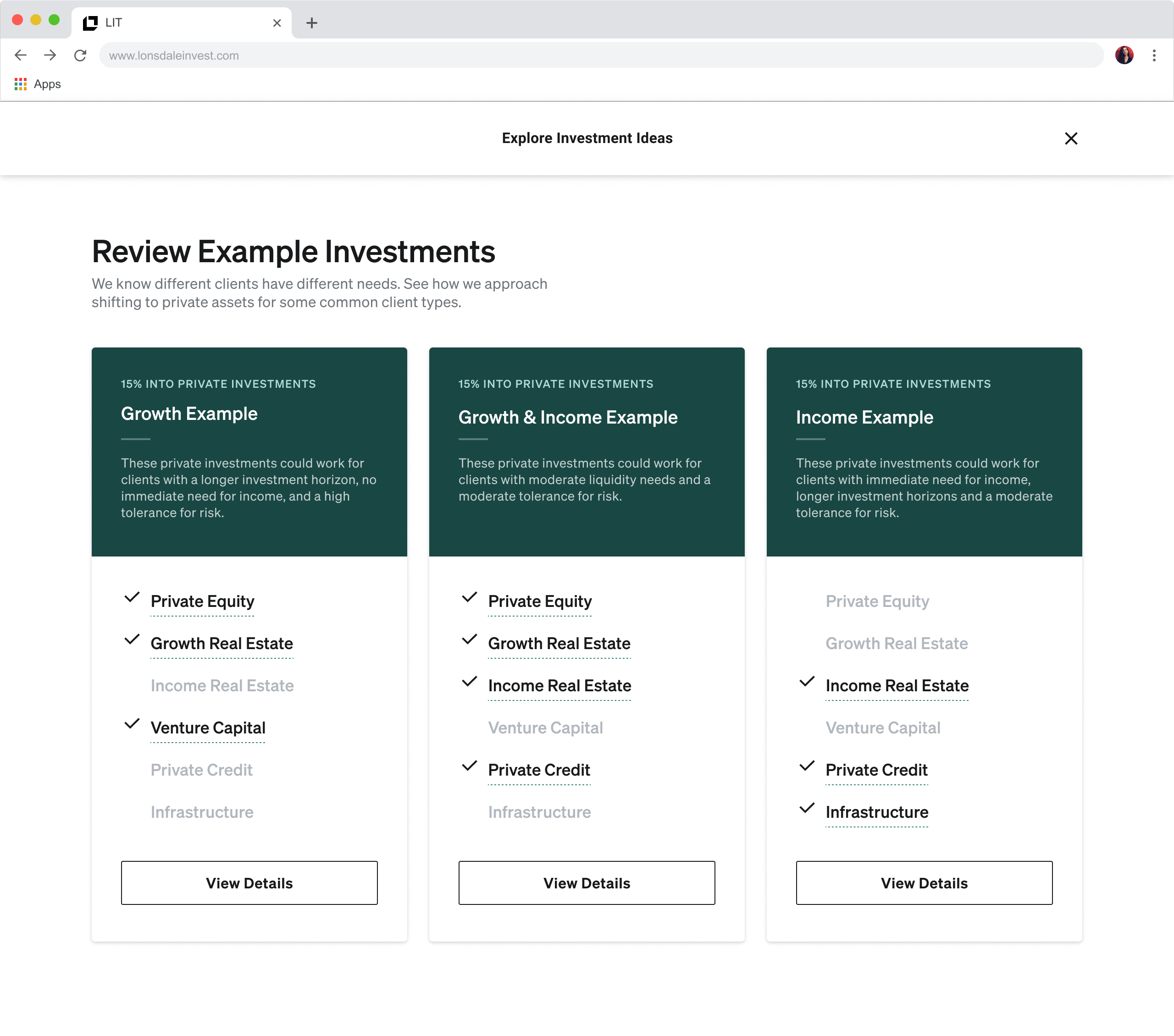
The original recommendation modal — preset model portfolios with no room for advisor judgment.
02 — First Initiative
Breaking the recommendation model
My first project was rethinking the entry point. The existing model forced advisors into pre-defined portfolios — select a model, pick an investor, and allocate money to a preset mix of funds. There was no personalization, no flexibility, and no room for an advisor's own judgment.
I designed and built a "Quick Checkout" flow — a streamlined path that let advisors bypass the recommendation engine entirely. An advisor could log in, browse individual funds, select one or more for a specific client, indicate dollar amounts, and move directly into the subscription process. It was a deliberate bet on giving advisors agency over their allocations instead of prescribing a model.
Design Decision
Shifting the starting point from "here's what we recommend" to "here's what's available" was the first step in trusting the advisor's expertise — and it surfaced a deeper problem we hadn't anticipated.
Even with easier access to individual funds, the company struggled to get buy-in from investors. Advisors weren't converting. The problem wasn't the checkout flow — it was something more fundamental about how we were asking people to invest.
03 — The Turning Point
Finding the real fear
After months of slow adoption, we stopped building and started listening. I worked closely with the sales team, sat in on advisor calls, recorded sessions, and dug into every piece of qualitative data we could find.
The Breakthrough Insight
Investors weren't afraid of private markets. They weren't afraid of spending money. They were afraid of putting $100,000 into a single fund. The fear was concentration risk — not the asset class itself.
The data told a clear story: investors cared more about investing across a mix of asset classes than about any specific fund. They wanted $100K spread 50/50 across Private Equity and Venture Capital, not $100K locked into a single Tacora Fund. It was the difference between a diversified portfolio and a one-way bet.
That insight changed everything. What if instead of selling individual funds, we gave investors a bespoke cocktail — a custom vehicle made of multiple slices across asset classes, tailored to their preferences, not restricted to a pre-built model portfolio? We called the concept a "Blind Pool," then a "Semi-Blind Pool," and eventually landed on the name that stuck: Custom Funds.
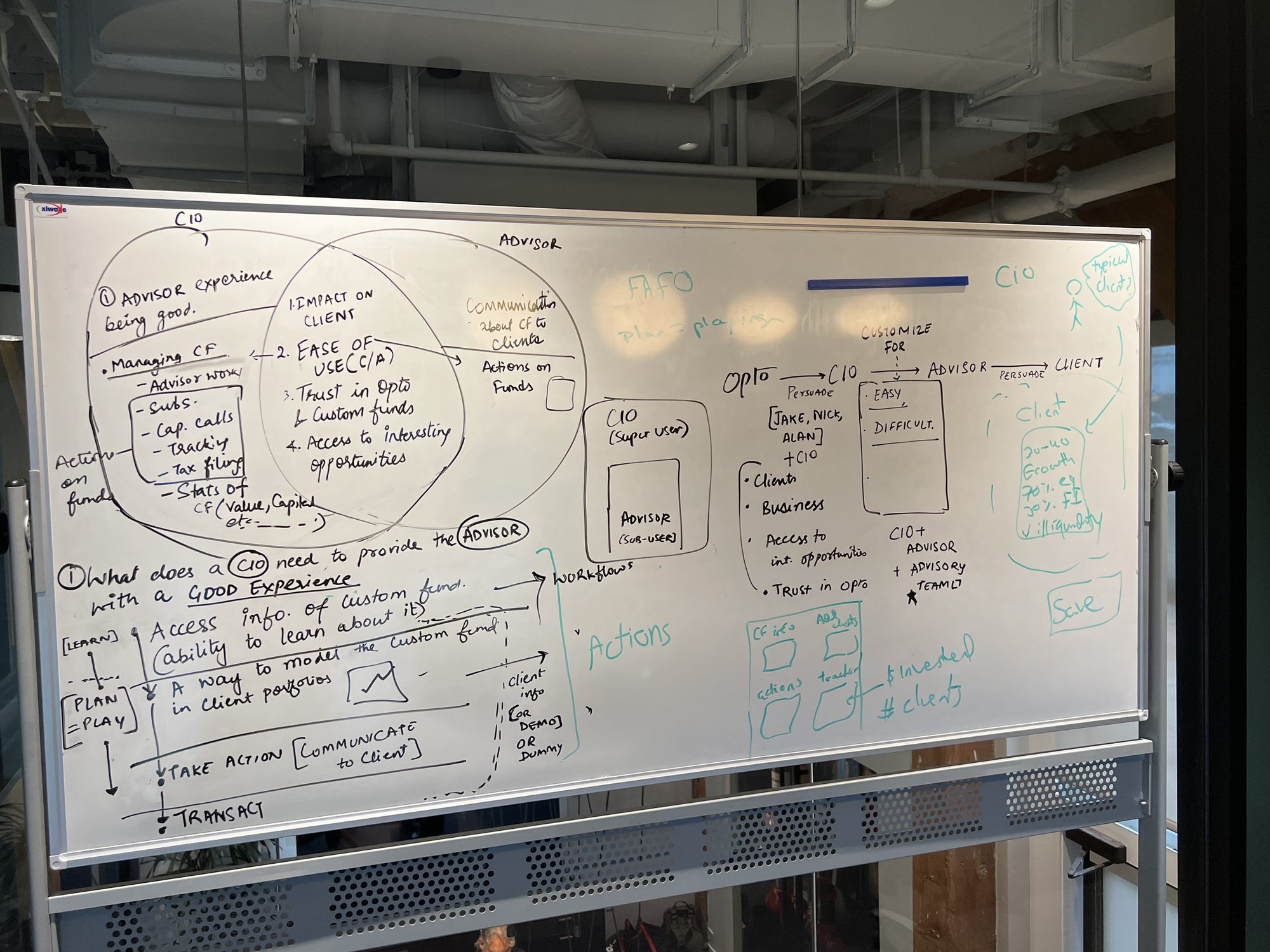
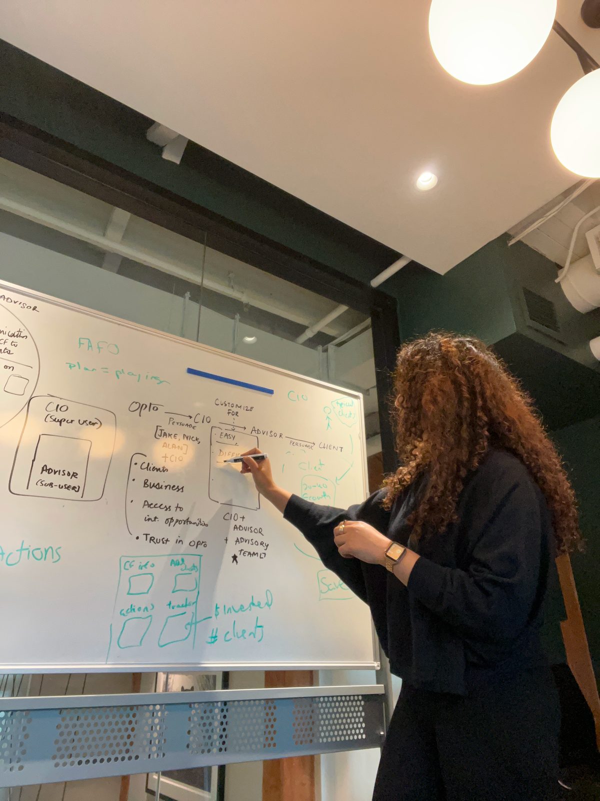
Early brainstorming sessions mapping the shift from Blind Pools to Custom Funds — defining user roles, actions, and the lifecycle that would power the pivot.
The Shift, Visualized
04 — Custom Funds
Designing the infrastructure that scaled the business
Custom Funds wasn't a feature — it was a new business model that required an entirely new set of tools, workflows, and user roles. And I was designing all of it alone. A year into my tenure, I became the sole designer at the company for nearly another full year — owning research, product design, and shipping across every surface while also delegating design needs for marketing and sales collateral, and leading the hiring process to build out the design team. As the only designer, I mapped the complete lifecycle from fund creation to capital deployment, identifying every touchpoint where a CIO, advisor, operations team member, or investor would interact with the system.
The Custom Fund lifecycle I designed for
Step 1
CIO creates a Custom Fund
Step 2
Fund appears on Advisor portal
Step 3
Advisor indicates client interest
Step 4
Subscription docs completed
Step 5
3rd-party validation
Step 6
Capital called & wired
Step 7
Ops maintains transfers
Step 8
Ongoing portfolio management
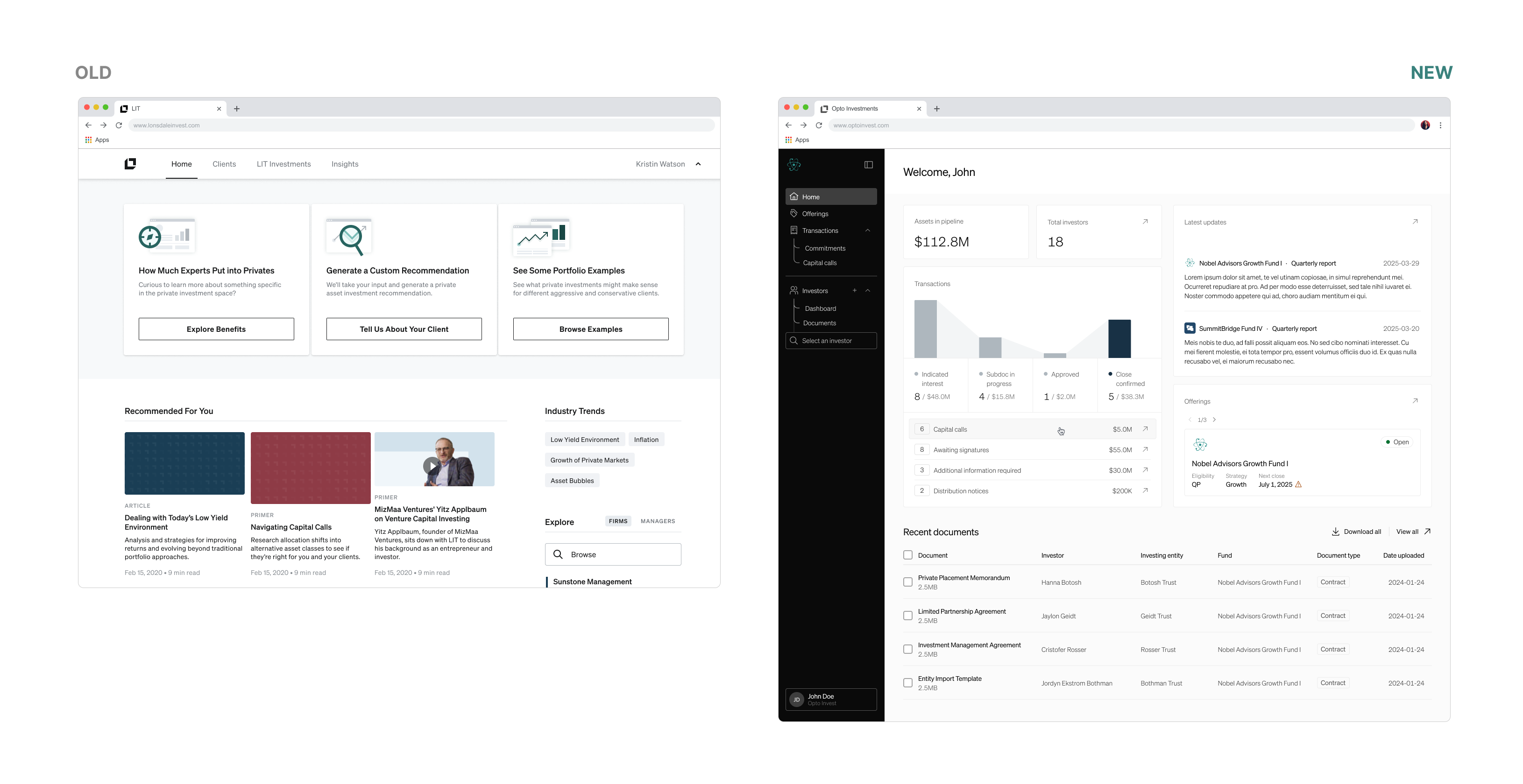
This pivot demanded a new portal entirely. The existing Advisor app couldn't support fund creation — that was the domain of CIOs, the decision-makers who research funds, structure vehicles, and set the investment strategy for their firms. I designed the CIO platform from zero: a research hub where CIOs could evaluate funds across asset classes, create Custom Funds for their firm, and monitor whether advisors were raising capital against them.
On the Advisor side, the app evolved significantly. Custom Funds surfaced as investable vehicles alongside the original offerings. I redesigned the subscription flow to accommodate the new fund structure while maintaining the TurboTax-like simplicity that was already working. The Investor portal followed — giving end clients access to tax documents, holdings, and eventually the fund updates that became one of our most valued features.
04b — Scaling Design
Growing the team, raising the bar
While I owned the Advisor app end-to-end — the core product surface where advisors researched funds, committed capital, and managed client portfolios — we hired new designers who took on the CIO side of the platform: fund creation, monitoring, and the research tools that powered Custom Fund construction.
As the firm count grew, so did the stakes. Opto was moving closer to becoming a fiduciary-grade platform — the kind of software that RIA firms trusted to manage regulatory compliance, client capital, and reporting. That trust had to be earned visually, too. Advisors presenting Opto's tools in client meetings needed the interface to project credibility and sophistication. A polished, professional UI wasn't vanity — it was a business requirement that directly impacted advisor confidence and firm adoption.
Meanwhile: Design System 1.0 → 2.0
We couldn't pause shipping to redesign. So we evolved the design system while the product was in flight — replacing components, refining the visual language, and elevating the entire UI piece by piece. The goal was simple: make advisors look smarter in front of their clients, and make Opto look like the institutional-quality platform it was becoming.
Home
05 — Confidence Tools
Building conviction with data: Planner & Pacing
Even with Custom Funds, advisors new to private markets hesitated. They understood the diversification benefit, but couldn't articulate to clients how these funds would perform over time or impact their overall portfolio. I needed to design tools that turned uncertainty into confidence.
Working closely with backend engineers, investment analysts, and the data team, I designed the Planner & Pacing tool — a system that modeled how private market investments would perform alongside a client's existing portfolio over time. But the problem wasn't just showing impact — it was helping advisors select the right funds for each specific client.
app.optoinvest.com/planner
To solve this, we bucketed investors into common preference profiles: Income, Growth, Balanced, and Custom model portfolios that firms could configure themselves. This categorization informed the pacing models and drove the design of a Bulk Investor Import flow I built to map client fields to model portfolios at scale, so firms could onboard their entire book efficiently.
From tool to deliverable
Advisors loved the Planner, but they struggled to take those insights into client conversations. That gap led directly to building automated Proposals — polished, shareable documents generated from the Planner that gave advisors a professional way to make the case for private market allocation.
05b — Beyond Design
The problem nobody was solving: how we build
As I was shipping features and running research, something kept nagging me. I was talking to every sales rep individually, and each one had a completely different take on where the product was falling short. Priorities were scattered, perspectives conflicted, and nobody seemed to have the full picture.
So I dug deeper. I ran structured interviews across the entire sales team — not to validate a design, but to understand where the organizational seams were tearing. What I found was systemic: Sales and Product had no regular syncs. Sales filed tickets requesting features or improvements, but those tickets landed in a backlog with no shared framework for prioritization. Every sprint was a negotiation between competing roadmap priorities, and nobody could articulate why one ticket mattered more than another or where it fit in the bigger picture.
Observed
Every sales rep had a different "top priority"
No shared language for what mattered most or why.
Diagnosed
Sales and Product were disconnected
No syncs, no shared roadmap visibility, tickets filed in a void.
Researched
How the best companies handle this
Studied Stripe, Airbnb, Spotify, and Linear's approaches to product evolution.
Named it
We were becoming a feature factory
Teams solving problems in silos, never addressing system-level issues together.
I was curious how companies like Stripe, Airbnb, Spotify, and Linear managed this transition from scrappy startup to structured product org. The research led me to a term that crystallized everything: feature factory. We were shipping features in response to individual requests, but never stepping back to ask system-level questions or make room for innovation. Each team was solving their own problems, but the bigger opportunities — the ones that required cross-functional alignment — were falling through the cracks.
The Framework I Introduced
Not every request is the same kind of problem. I proposed we stop treating them equally and start categorizing work by its nature and ambition.
🔧
Quick Fixes
Bugs, UI issues, and small friction points that can ship within a sprint
e.g. broken filter, typo, layout bug
📈
Product Improvements
Enhancements to existing features that make the current product better
e.g. better search, faster onboarding
🚀
Product Capabilities
New features that extend what the platform can do for users
e.g. Bulk Import, Proposals, Pacing
💡
Innovation
Net-new bets that open entirely new value propositions or revenue
e.g. Radar, AI Due Diligence
This wasn't a design deliverable — it was a structural intervention. The framework gave Product Managers a shared vocabulary to triage incoming requests, plan sprints with intention, and build quarterly roadmaps that balanced immediate needs with long-term bets. It changed how four PMs prioritized work, how engineering allocated capacity, and how the company thought about what to build next.
Impact beyond design
A designer identified a broken process that nobody on the product or engineering side had named. By researching how the best companies scale, introducing a shared framework, and getting buy-in across teams, I helped shift Opto from reactive ticket-chasing to intentional, system-level product thinking.
06 — A Three-Person Design Team
Three designers, three fronts, one platform
By this stage, the hiring work paid off and we grew into a three-person design team. I continued leading the Advisor app end-to-end and took on Radar as a 0→1 product, while the other two designers shipped Fund Updates (performance insights for investors) and AI Due Diligence (a standalone SaaS research tool for CIOs that became Opto's second revenue stream). Three designers, each owning a critical surface, shipping independently but building toward the same vision.
07 — My Parallel Products
Evergreen Funds and Radar: shipping on two fronts
🌱
Evergreen Funds
A client firm requested a new fund type with Tender Offers — a mechanism for periodic redemption that didn't exist in our system. I designed the full Tender Offer workflow within a week and presented the solution directly to the client. This expanded our fund-type vocabulary and opened the door to new firm structures.
📡
Radar: 0 → 1 Product
Investment analysts, product, and engineering identified a gap in private market portfolio rebalancing and over-allocation detection. I designed Radar from scratch and tested it onsite for a week with Fi3 Financial in Indianapolis — a firm managing nearly $1B AUM. Radar is still in early validation.
Radar was a different kind of design challenge — not an extension of the existing product, but an entirely separate value proposition. Spending a week embedded at Fi3's office, observing how advisors actually rebalanced portfolios (spoiler: spreadsheets and gut feel), gave us the signal we needed to validate the hypothesis and refine the product before broader rollout.
08 — The Evolution
From scrappy startup to scaled platform
Mid 2022
Day One
Joined a team with educational content, three model portfolios, and a digital subscription flow. Zero paying clients. The technology was ahead of the market, but the product wasn't meeting advisors where they were.
Late 2022
Quick Checkout & Discovery
Shipped Quick Checkout to give advisors agency. Discovered through research that concentration risk — not private markets — was the real barrier to adoption.
2023
The Custom Fund Pivot
Designed the full Custom Fund lifecycle, built the CIO portal from zero, and evolved the Advisor app. 4,809 funds were researched on the platform. The business started scaling.
2024
Confidence & Scale
Shipped Planner & Pacing, automated Proposals, Fund Updates, Bulk Import, and Evergreen Funds. 15+ firms onboarded. Committed capital crossed $600M.
2025
New Revenue Horizons
The company launched AI Due Diligence as a standalone SaaS tool for CIO fund research. Continued validating Radar onsite with a $1B AUM firm. Opto evolved from a single-product company to a multi-revenue-stream platform.
How Custom Funds Changed the Business
💰
$100K → 1 fund
Before
Single-fund, high-stakes bets
Investors had to commit $100K into one fund in one asset class. No diversification, no flexibility — just a locked position for 6–10 years.
After
Bespoke multi-asset cocktails
Custom Funds let firms create vehicles mixing PE, VC, Real Estate, and more — tailored to each firm's investment thesis instead of a preset model.
🔭
→
🔎
→
📦
New Platform
CIO portal created from zero
CIOs needed a dedicated space to research funds across asset classes, build Custom Fund vehicles, and monitor capital raise progress across their advisors.
Unlocked
Advisor confidence to sell private markets
Planner, Pacing, and automated Proposals gave advisors the data-backed tools to confidently recommend private market allocations to their clients.
🏢
🏢
🏢
🏢
🏢
🏢
🏢
🏢
🏢
🏢
🏢
🏢
🏢
🏢
🏢
Scale
0 → 15+ RIA firms onboarded
Custom Funds became the primary value proposition. Firms didn't just use the platform — they built their private market practice on it.
⚖
Platform
+
🤖
AI Due Dil.
Revenue
From 0 to 2 SaaS revenue streams
What started as a single product evolved into a multi-revenue platform: core subscriptions plus AI Due Diligence as a standalone SaaS offering for CIO fund research.
09 — Outcomes
Impact by the numbers
0 clients
↓
15+ RIA Firms
Enterprise adoption including major US wealth management firms
$207M committed
↓
$600M+
Committed capital on platform, nearly 3x growth
0 Custom Funds
↓
29 CFs Deployed
Bespoke multi-asset-class vehicles created by firms
533 transactions
↓
1,363
Completed transactions, 2.5x growth in platform activity
Limited catalog
↓
4,809 Funds
Funds researched on platform, powering CIO decision-making
0 SaaS revenue
↓
2 Revenue Streams
SaaS offerings (AI Due Diligence + platform subscriptions)
10 — Decisions
Key design decisions
01
Advisor agency over algorithmic prescription
Replacing the rigid model-portfolio starting point with an open fund marketplace gave advisors control. This surfaced the deeper insight about concentration risk that led to the Custom Fund pivot.
02
Lifecycle-first design
Instead of designing screens, I mapped the entire fund lifecycle across user roles. This systems-level view ensured that CIO, Advisor, Operations, and Investor experiences were coherent and connected.
03
Confidence before conversion
Building Planner & Pacing before optimizing the subscription funnel recognized that the bottleneck was advisor confidence, not checkout friction. Automated Proposals turned that confidence into a client-facing deliverable.
04
Ship fast, validate onsite
For Evergreen Funds, I designed and delivered the complete Tender Offer flow in a week. For Radar, we tested the hypothesis by spending a week embedded at the client's office. Both approaches prioritized speed-to-signal over polish.
10b — System-Level Thinking
Small reframes, disproportionate impact
Beyond large product bets, I tend to look for system-level inefficiencies where small reframes can unlock disproportionate impact. Across these stories, my role wasn't improving usability. It was identifying where the system itself was misaligned with how users think, work, and decide.
01
Top-5 US Bank Request → Permission System
"What looked like a new feature was actually a permissions system problem."
What it looked like
A major bank asked for a new analyst product. A new role, new workflows, weeks of engineering.
What I saw
This isn't a feature gap. It's a permission model gap.
The pivot
Reused existing roles, introduced toggle-based permissions, added a lightweight feedback loop through comments.
Delivered immediately. Avoided weeks of work. Increased enterprise trust.
Feature Request
↓
System Architecture
02
Subdoc Automation → Data System Insight
"We weren't simplifying forms. We were fixing how data flows through the system."
What it looked like
Advisors were re-entering the same data across every investment. A long, painful form UX problem.
What I saw
This isn't a form problem. It's a data reuse failure.
The pivot
Connected investor profiles to subdocs. Pre-filled entity data across flows.
The real problem hides behind the obvious one. Investors didn't reject private markets — they rejected concentration risk. That distinction, which only emerged through deep qualitative research, redirected the entire company's trajectory.
🎛
Design the system, not the screen. With three user roles, multiple fund types, and a regulatory-heavy domain, the value of design wasn't in individual interfaces — it was in ensuring every touchpoint connected into a coherent lifecycle.
🚀
Founding-stage design means wearing every hat. For nearly a year I was the only designer in the company — running research, shipping product, delegating marketing and sales design, and hiring new designers, all at once. Embracing that breadth instead of waiting for support was how I created the most impact.
🤝
Sitting with users changes everything. A week embedded at Fi3's office taught me more than months of remote interviews. Proximity to the real workflow — the workarounds, the spreadsheets, the frustrations — is irreplaceable.
A final note
Opto was a once-in-a-career opportunity — the kind where you join when there's nothing and leave having shaped something real. Over almost four years, I helped turn a promising piece of technology into a multi-platform product that firms trusted with hundreds of millions in committed capital. Every problem was exciting, even when there was a lot of uncertainty. Trust in the product team kept us going — through failed experiments, late pivots, and the slow, unglamorous work of finding product-market fit. Looking back, it all made sense. I'm proud of the business metrics, but I'm prouder of the design decisions that made them possible: listening when things weren't working, pivoting when the data was clear, and building tools that gave advisors the confidence to do something genuinely new in financial services.