Quick Brief — for the hiring manager
Context & Problem
Splitwise was the market-leading bill-splitting app with 5 million downloads on Android alone. Venmo dominated the US with 10M+ users, but Splitwise had penetrated deeply in India and internationally. Yet despite massive adoption, user satisfaction was near zero.
As a heavy user myself, I felt the friction firsthand. Living with roommates meant splitting recurring bills, tracking shared expenses, and handling the emotional awkwardness of money between friends. The app failed at the exact problem it was built to solve — and users were defaulting to their calculator app for anything beyond equal splits.
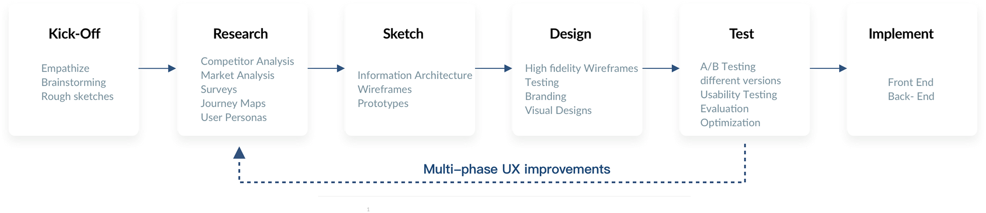
Research Strategy
I approached this redesign with three research pillars: mining critical reviews for unfiltered pain points, conducting direct user interviews, and analyzing the competitive landscape.
2.1 — App Review Mining
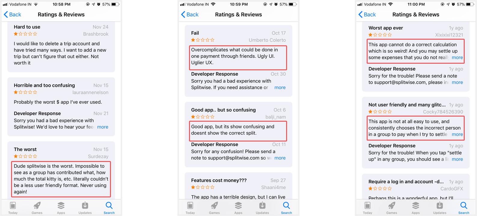
The 1-star and 2-star reviews on both Google Play and the App Store became my primary research corpus. These reviews were brutally honest. Users complained about:
- No way to exclude themselves from items they didn't consume
- Confusing math and convoluted payment reconciliation
- Difficulty finding quick actions — too many taps
- Completely different experiences between iOS and Android
- Clunky language that felt more like accounting software than a friendly app
2.2 — User Interviews
I interviewed friends and roommates who were heavy Splitwise users. The pattern was unanimous: they loved Splitwise for tracking, but they hated using it for anything complex. The interview questions: "What do you like most?" and "What makes you want to use something else?"
The answer: "I like that it exists. But I hate that it's so hard for unequal splits."
2.3 — Competitive Analysis
Market landscape at 2016:
| Product | Android Users | Key Feature | Gap vs Splitwise |
|---|---|---|---|
| Venmo | 10M+ | P2P payment | Focused on settling up, not splitting bills |
| Splitwise | 5M+ | Equal splits | No itemized splitting, platform inconsistency |
| Tab (other app) | 50K | Simple splits | Too basic, no recurring expenses |
The insight: The real competitor was the calculator app. Users defaulted to manual calculation because it felt faster than wrestling with Splitwise's UI for anything beyond equal splits.
Ideation & Concept
3.1 — Use Cases
I mapped seven recurring scenarios where unequal splits broke the current system:
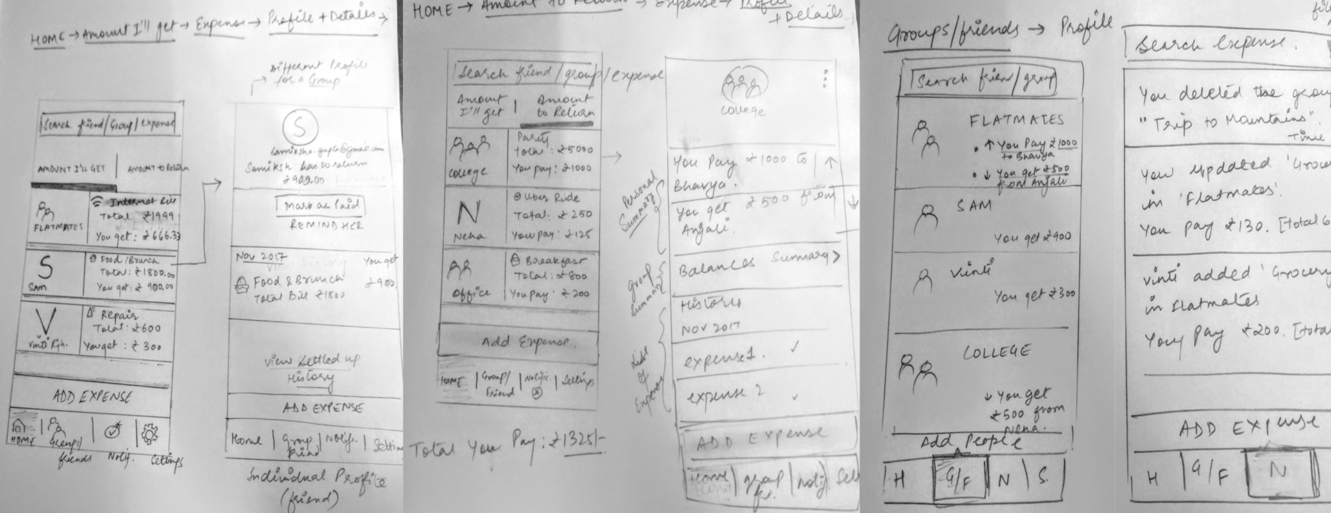
3.2 — Brainstorming & Sketching
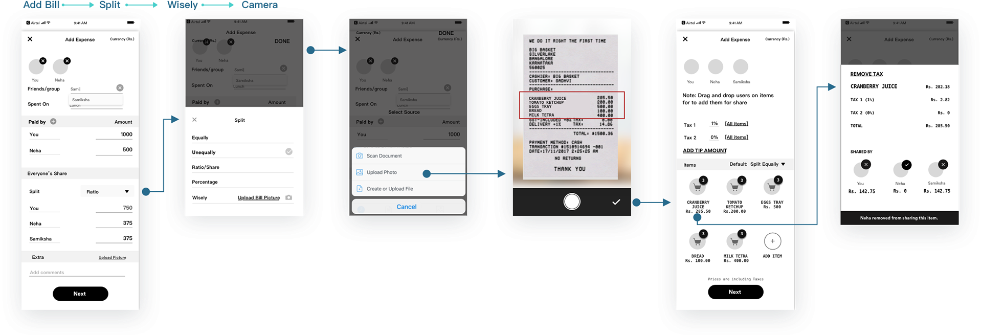
I sketched multiple approaches to itemized splitting. The core insight: make it so visual and simple that a user never has to think. Instead of forms and math, show line items from the receipt with names assigned inline.
3.3 — The "Split-Wisely" Concept
Split-Wisely was the centerpiece solution: bill-scanning via receipt photo. The API parses line items. Users tap to assign each item to specific people. Alcohol? Tap it to exclude yourself. Netflix? Tap to split among streamers. Simple, visual, forgiving.
The name itself was aspirational — "split wisely" meant handling the emotional and practical complexity of shared money. Not just splitting bills; splitting them fairly and thoughtfully.
Design & Execution
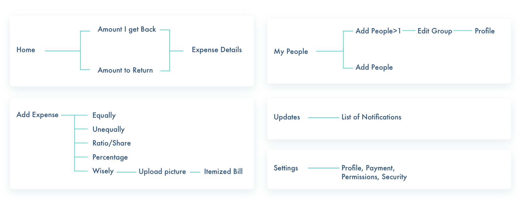
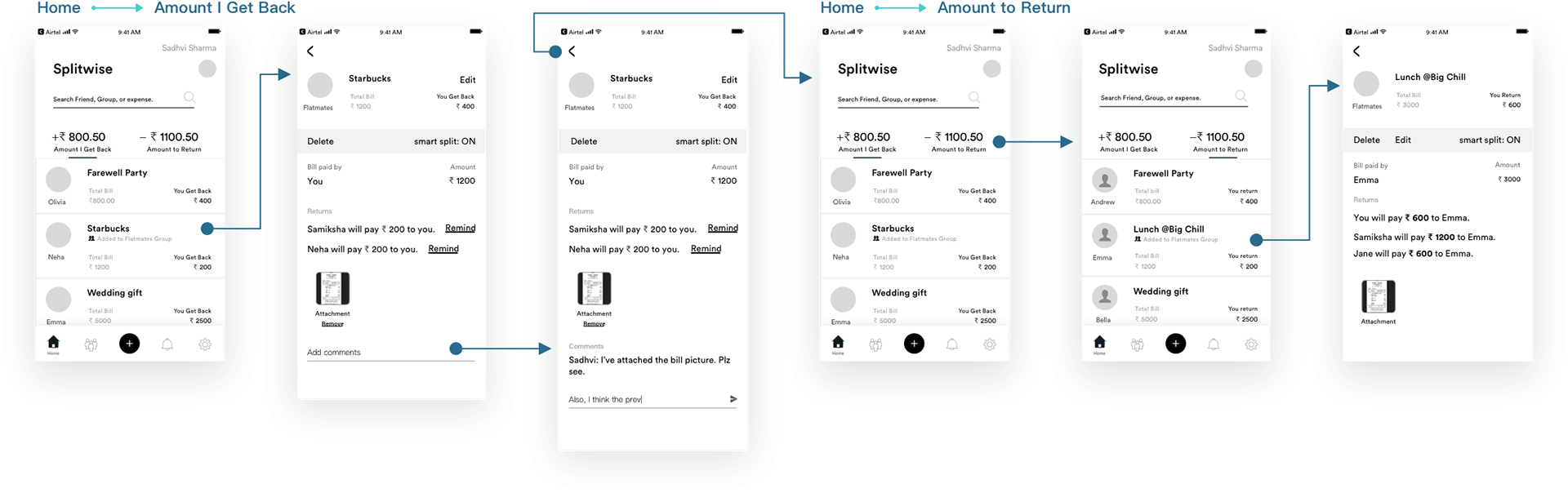
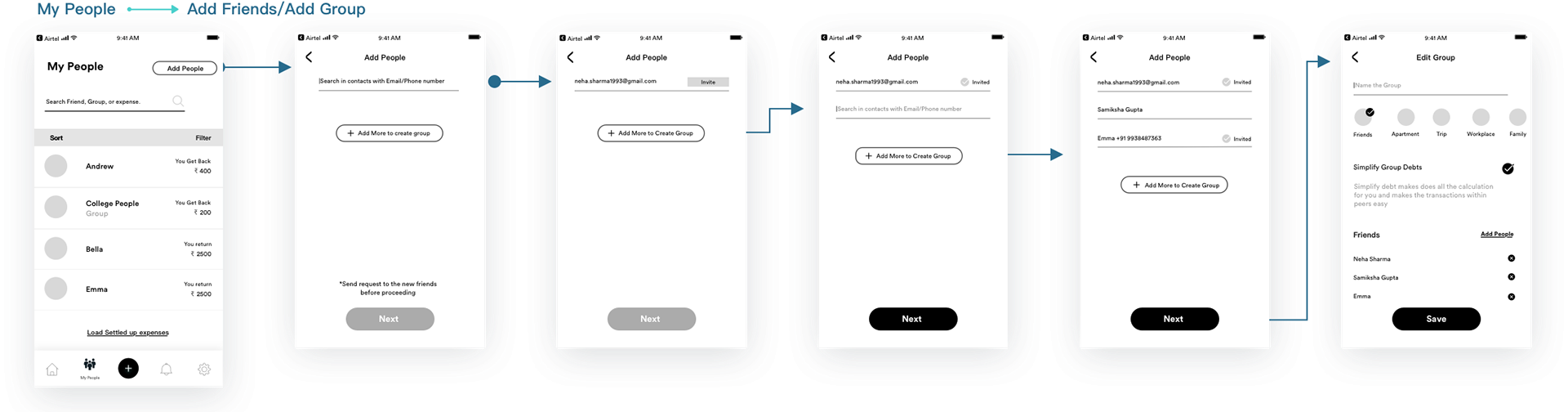
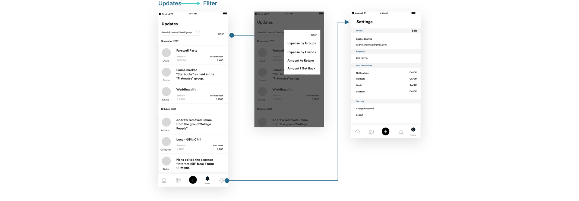
4.1 — User Flows & Navigation
I mapped the critical flows: adding a bill, splitting it (equal vs. unequal), itemizing via Split-Wisely, and settling up. Each flow prioritized speed and clarity over feature breadth.
4.2 — Low-Fi to Hi-Fi Wireframes
Started with low-fidelity pencil sketches, then moved to Sketch for medium-fidelity wireframes focused on layout and information hierarchy. Tested assumptions about where users expected buttons and information.
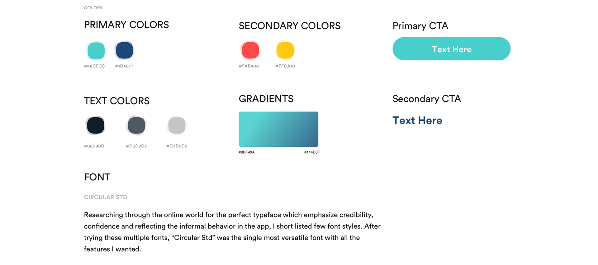
4.3 — Rebrand: Color Psychology & Brand System
The original Splitwise used a saturated, demanding green — #2ECC71 — that felt transactional and urgent. Money is inherently stressful. The redesign moved toward softer greens (#1CC29F), blue accents for trust and clarity, and warm neutrals for approachability. The color palette communicated: "Splitting money is awkward, but we're handling it together. You can trust this app. Relax."
Defined the full brand system — primary and secondary colors, text colors, gradients, CTA styles, and typography. Chose Circular Std for its credibility, confidence, and informal warmth — reflecting how the app should feel when handling money between friends.
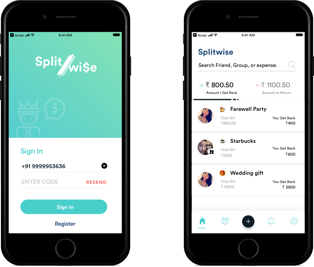
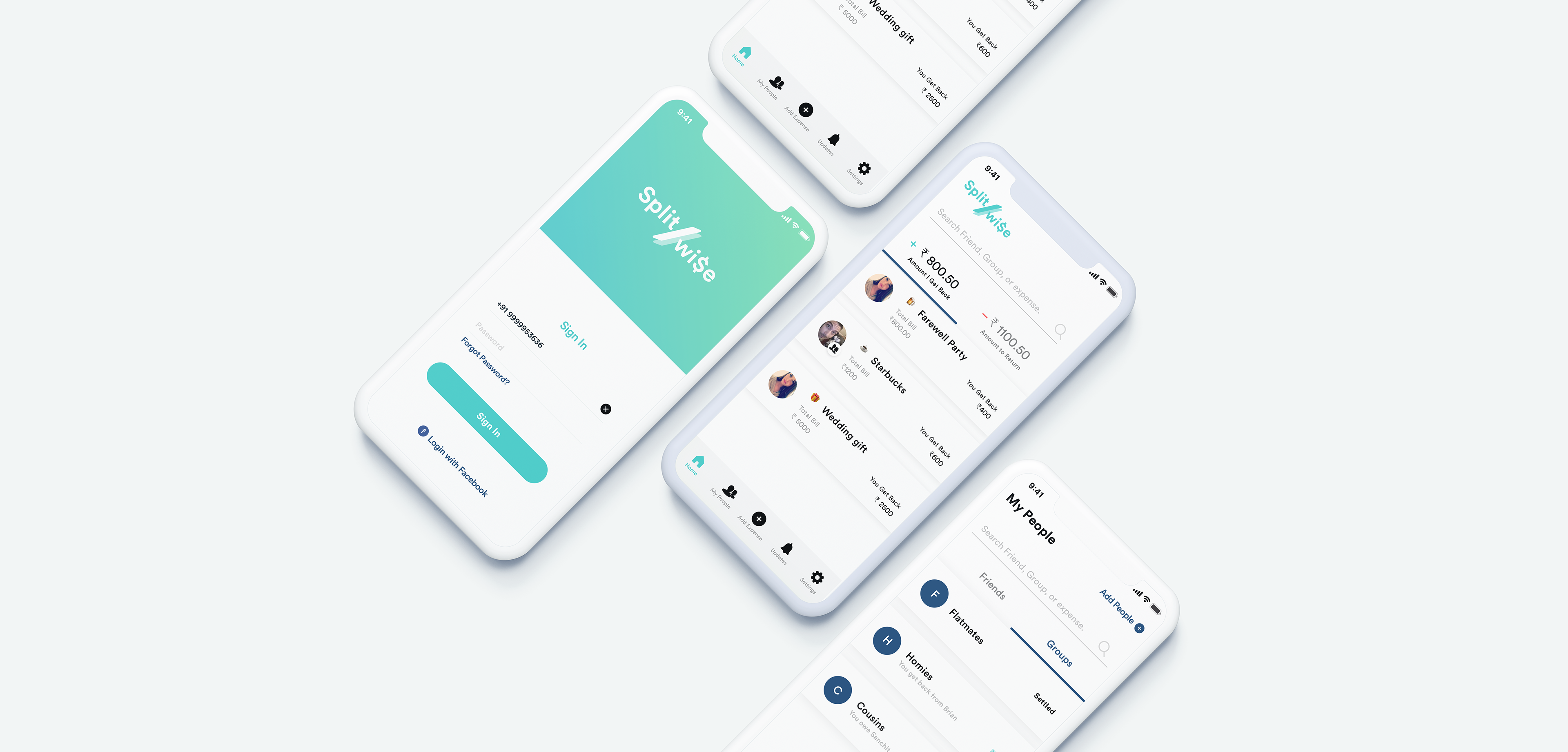
4.4 — Visual Design & Hi-Fi Mockups
High-fidelity mockups brought the experience to life. Tested typography, spacing, interaction states, and the Split-Wisely itemized billing screen design.
Outcomes & Impact
2020 Update: Validation
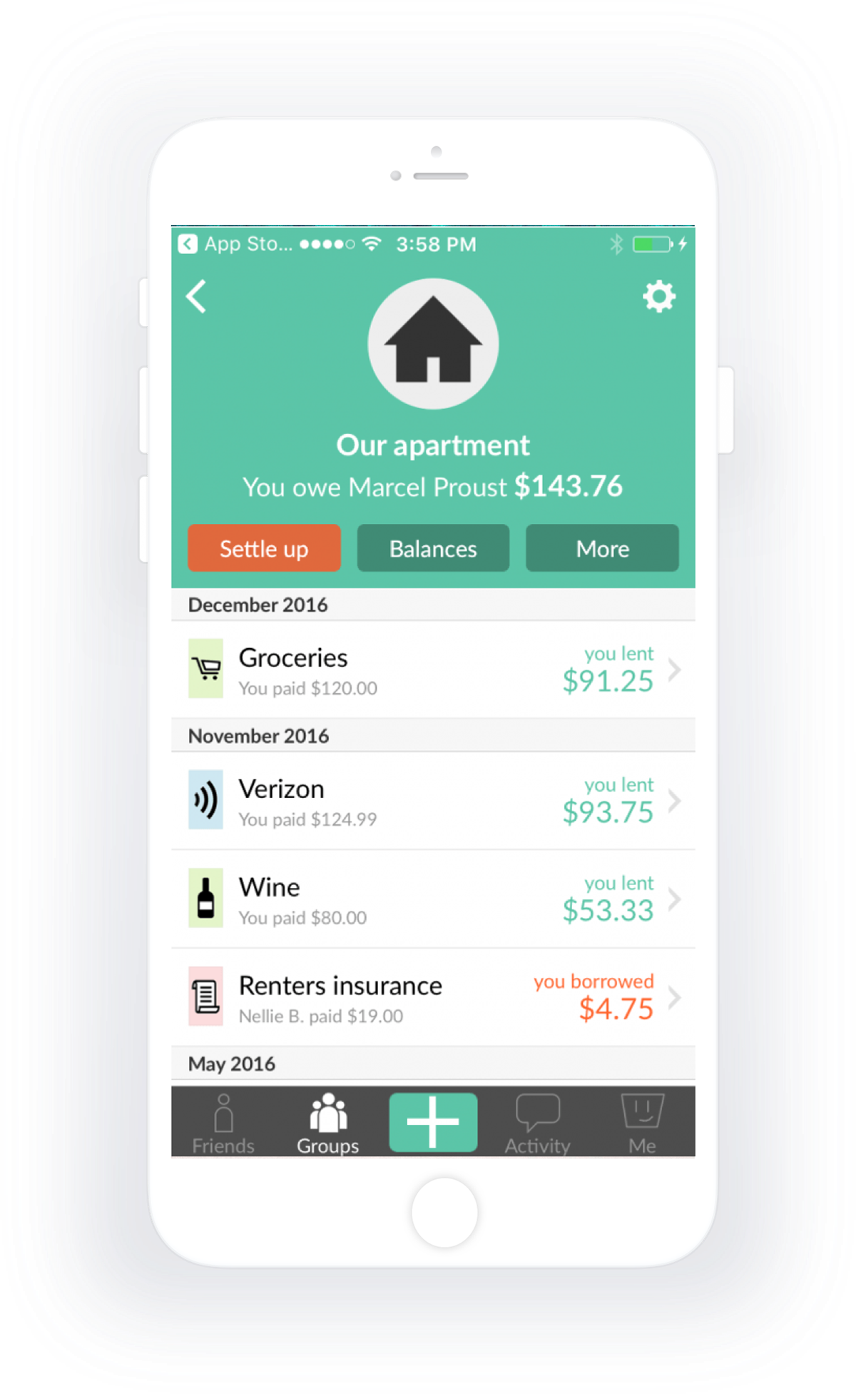
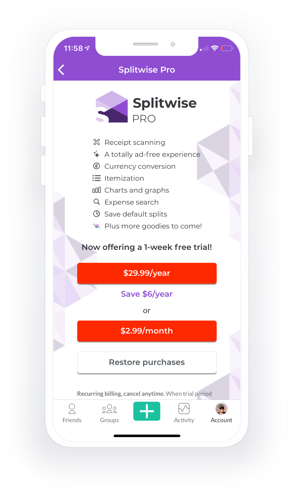
Four years after this May 2016 redesign, Splitwise shipped an update that validated every core concept designed here.
6.1 — What Splitwise Shipped
In 2020, Splitwise introduced:
- Receipt scanning and itemized splitting — exactly the Split-Wisely flow designed in 2016
- Unequal splits — the core use case that broke the old system
- Premium tier for the feature — recognizing its value and complexity
The 2020 feature was, in execution, nearly identical to the 2016 design. Different teams, different code, four years of market evolution — but the same insight had arrived at the same solution.
6.2 — The Market Timing Question
Why the four-year gap? Several factors likely played in:
- OCR/ML maturity — receipt scanning via computer vision was harder in 2016 than 2020
- Mobile API access — accessing camera and gallery was more restricted in 2016 iOS
- Server costs — parsing receipts at scale required infrastructure investment
- Market pressure — by 2020, competitors and user demand made the feature essential
The idea wasn't wrong in 2016. The market just wasn't ready for the execution cost.
Learnings
This project showed me that good design thinking produces solutions that outlive their initial context. The core insight — that itemized bill splitting is essential, and that emotional design matters more than functional polish — was right in 2016 and stayed right until 2020, when the rest of the world caught up.
Sometimes the best validation is quiet. It's shipping years later under a different name, knowing that your instinct was sound all along.